How to Design an App Logo That Will Make You Stand Out
8 minute(s) read | Published on: Aug 26, 2022 Updated on: Aug 26, 2022 |
You want that first impression to be one that instantly turns curious browsers into devoted users. A great app logo guarantees that the first impression will be one that hooks would-be users while, at the same time, ensuring your app stands out from the rest.
And rest assured, your app will likely be one of many, whether it’s dozens or even hundreds. As a result, most users choose their apps based alone on what the app logo looks like. It’s not enough to design a logo that readily appeals to your target audience, but it must also stand out from the multitude of other options already available.
Plenty goes into designing a unique and genuinely good-looking app logo. Nevertheless, the logo remains one of the most overlooked elements of mobile app design. This article will show how you can create a truly unique app logo, starting with seven crucial points to remember when designing your next app logo.
Keep It Simple
“Less is more” is a shopworn saying, but it’s absolutely true when it comes to logo generator ai. Too many design elements can make an app-logo feel visually cluttered. A cluttered logo not only hurts brand recognition but can also confuse and even turn off potential users.
Instead, take a minimalist approach to apps logo design. The cleaner and simpler the design, the easier it is for users to immediately recognize and understand. Take the below apps logo for example. With its white outline and solid purple background, this flower motif is as uncomplicated as it gets, you immediately associate it with certain industries or services. It also manages to pull off a bold, almost three-dimensional appearance.
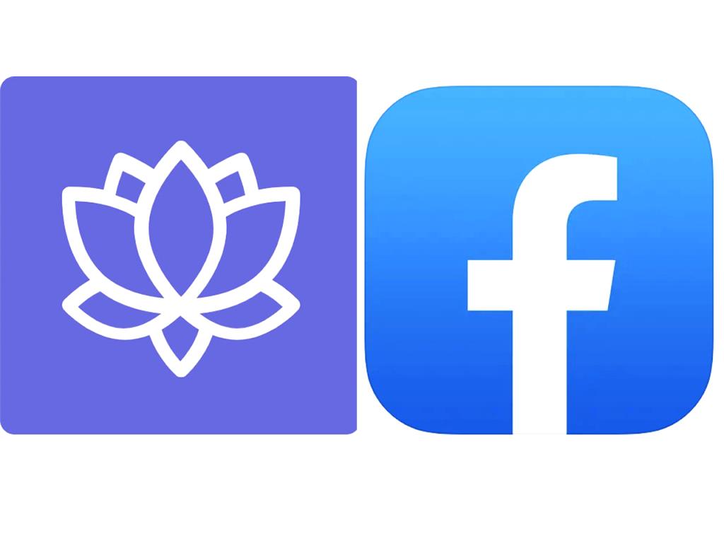
Facebook’s application logo is another example of simplicity as good design. That iconic lowercase “f” tells you everything you need to know about the application. People instantly know what it is and who provides the application despite it being a very minimalist design.
Think About Your Target Audience
Your mobile application has a target audience and so does your application-logo. Consider who’s going to use your application, what they’ll expect of it, and the things they’ll likely appreciate and embrace. You’ll want your application logo to convey what’s in store for users in a concise, yet friendly way.
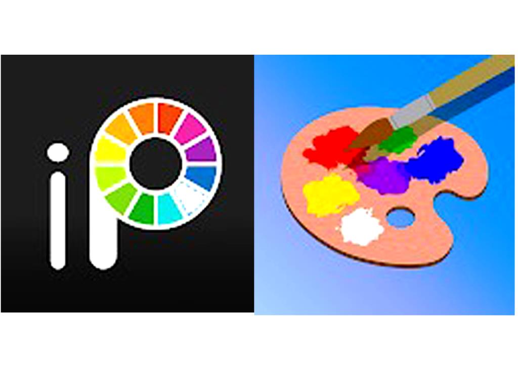
Consider painting apps, for example. One logo design may convey an app made for young beginners and casual users while another suggests an app geared towards users with more advanced artistic skills. Keep your target audience in mind as you generate your app-logo concepts.
Also, don’t forget about A/B testing. Have several variations of your application logos ready for trial before submitting your final design. “Test driving” your application logos with the help of testing tools or by testing within the app store itself lets you see how users respond to your new designs. SplitMetrics found that A/B testing of mobile application designs helped boost application page performance by as much as 26 per cent.
Use Vibrant Colors
Let’s stop for a moment and take a page from nature. What do the vivid plumage on a male peacock, the bright yellow and black stripes on a yellow jacket wasp, and the striking blues, yellows, and oranges of poisonous tree frogs have in common? They all serve to grab our undivided attention, whether it’s to attract mates or warn predators to stay away.
As visual creatures, bright and vibrant colors naturally command our attention. Employing vibrant colors for your application logos does the same thing to grab a user’s attention and draw them further into the application experience. Think bright yellows, blues, reds, and greens. Dull or neutral colors like grey and tan, in comparison, may leave your application unnoticed.
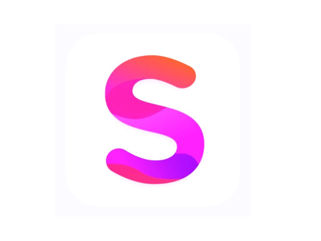
Gradients are another way of spicing things up in the color department. This “S” application logo blends several bright colors into a rather unique gradient. The end result is a fun and dynamic application logo that’s also an instant attention-getter.
The color palette is one of the most important factors that can make or break an application logo. When choosing colors for your application logos, make sure they complement the application UI colors. This creates a sense of continuity in users’ minds and firmly connects your logos with the rest of the application.
Don’t Use a Lot of Text
Remember when we said, “less is more?” That also applies when it comes to text. The last thing you’d want to do is force a lot of text into a logo, especially one that’s destined for mobile app use. After all, you only have so much screen estate to work with on the average smartphone or tablet.
With that said, scalability is a key aspect of any application logo design. You want your application logo to remain legible across a broad range of logo sizes, from tiny 29 x 29-pixel logos to those blown up to 1024 x 1024 pixels. Adding text makes it significantly harder to scale your application downwards. As text gets smaller, it also becomes barely legible, making your app logo much harder to spot and recognize at first glance.
The key is to use as little text as possible if you plan on using any text. Leave the application name out of the logo, if possible. When done correctly, your textless application logo will be inseparable from your brand and apps. One-letter logos are a good compromise for those who want a stronger association between their brand and logo. Again, see Facebook’s application logo for more proof.
If you do need text for your application, the logos design below is a good example to follow. The text itself is not just short and sweet, but also in a font that’s easily readable even when shrunken down.
Logo design by Brandcrowd
Be Different From Competitors
There are likely hundreds, even thousands of similar applications on your targeted app stores, each with a similar app logo design and each one vying for users’ attention. You want your application design to stand out and not blend in with other apps. Even if your app is genuinely one-of-a-kind, a genuinely distinctive logos puts you head and shoulders above the competition.
Using unique glyphs really helps, here. For instance, the Waze application logos features a one-of-a-kind icon featuring a smiling chat box on wheels. Not only does it sum up everything to expect from the app, but it also stands out from the usual multitude of similar apps.
Do your research and see what the competition is doing with its logos. This gives you an opportunity to go a different direction and try out approaches your competitors are likely overlooking.
Think About Contrast
Consider the average smart device user and the vast variety of background images they regularly use. Now consider that your app logo has to stand out no matter what kind of colors or patterns lurk in the background. A high-contrast logo has a better chance of popping from amongst an otherwise cluttered background.
Most high-contrast app logos feature a black-on-white or white-on-black design just to stand out more from background imagery. Others use a colored border to stand out against particularly colorful backgrounds. If you plan on using a border, make sure it’s at least 5 pixels wide to ensure your logos remains visible even on color-matched backgrounds.
Understand Platform Guidelines
While you want your app-logo to look good, you’ll also want it to abide by your app stores’ design guidelines. These guidelines don’t just cover the overall dimensions and resolution for your app-logo on each platform and device, but also the desired format, colors, and even the logo’s overall shape.
Having a good grasp of each platform’s design guidelines lessens the likelihood of your app being rejected from your platform’s app store. It also ensures your app logo looks professional and consistent with the rest of your app’s overall design.
No one said designing an app logos would be easy, but it’s not the frustrating experience you’re probably imagining. The seven key points mentioned above should give you a better idea of how to bring your successful app-logo design to life.
About our Android and iOS app development services